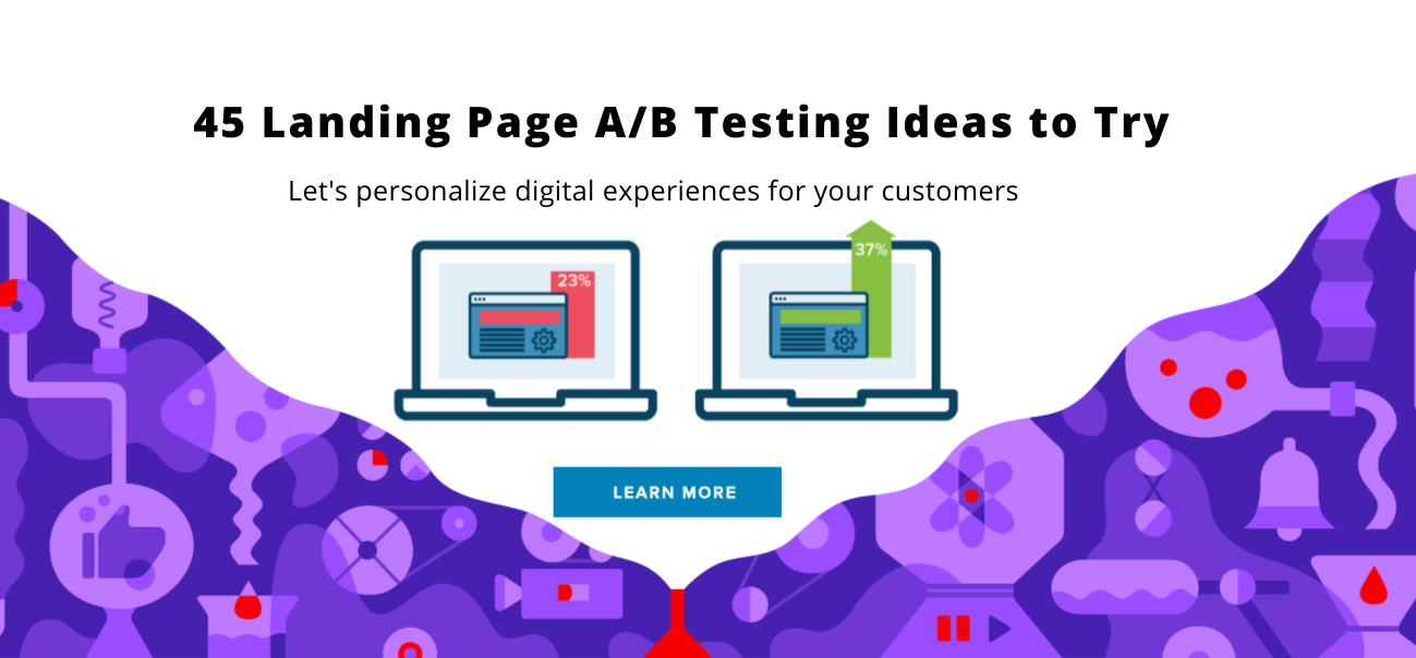
Digital touchpoints are an essential factor brands take into account when developing digital marketing strategies. Since Amazon started personalizing recommended products based on previous viewing histories and preferences, other companies followed and began to provide more personalized content experiences. For instance, Netflix’s engineers and designers are always testing movie poster images to get users to click through to a movie or new series. Ad companies and businesses do the same thing. We test and test to see what image or copy helps our clients get more clicks.
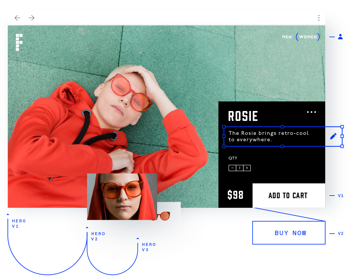
In order for companies to increase profits through their websites, marketers develop conversion rate optimization strategies to help businesses with ideas to improve the rate of conversion on web pages. Marketers start out by testing elements that appear to be barriers to a conversion — such as imagery, messaging, and design — to figure out what will actually have a positive impact. Part of the strategy involves testing Version A against version B on a page. This is what is referred to as A/B Testing.
A/B testing or split testing is essentially an experiment where two or more variants of a page are shown to users at random and a statistical analysis is used to determine which variation performs better for a given conversion goal. As an experienced digital marketer and SEO specialist, I love A/B testing and conversion rate optimization (CRO) because they are two of the few tools (subsets of customer journey mapping and improving user experience) that can have a significant impact on the performance of all your digital channels. In other words, it’s well worth the investment of learning these techniques or hiring someone to carry them out (in-house or an agency). The type of business you are and what you are trying to offer or sell will make a difference in what you end up testing. I’ve compiled a list of ideas which can be broken up by vertical:
An e-Commerce Company – should think about increasing the number of completed checkouts, the average order value or increasing holiday sales. To accomplish this, A/B test:
- Homepage and promotions
- Navigation elements
- Product pictures and copy
- Product page layout
- Cross-sell / Up-sells
- Checkout funnel components
A Software Technology or App Company – Should think about increasing the number of high-quality leads for the sales team, increasing the number of free trial users to attract a specific type of buyer. A test might include:
- Lead form components
- Free trial signup flow
- Methods to increase funnel conversions
- Homepage messaging and call-to-action
- App layout to improve user experience
- App monetization
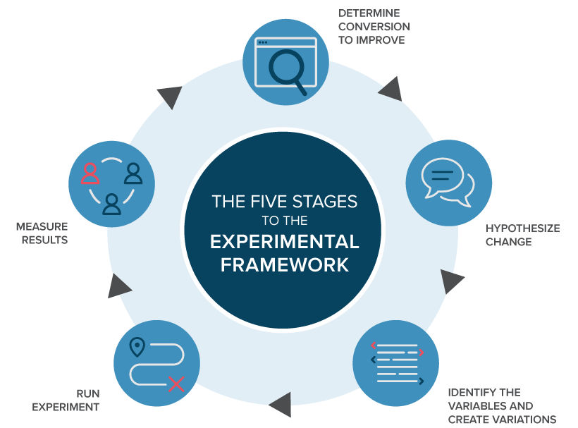
The following is an A/B testing landing page framework you can use to start running tests:
- Strategize by using Data: Your analytics will often provide insight into where you can begin optimizing. Analytics help you to initially focus on areas of your site/app with high traffic as that will allow you to gather data faster. Look for pages with low conversion rates or high drop-off rates that can be improved.
- Identify Goals: Your conversion goals are the metrics that you are using to determine whether or not the variation is more successful than the original version. Goals can be anything from clicking a button or offering a promotion code to product purchases and e-mail signups.
- Generate a Hypothesis: Once you’ve identified a goal you can begin generating A/B testing ideas and hypotheses for why you think they will be better than the current version. Once you have a list of ideas, prioritize them in terms of expected impact and difficulty of implementation.
- Create Variations: Using your A/B testing software (VWO, Apptimize, Clicktale, Optimizely…etc) make the desired changes to an element of your website or mobile app experience. This might be changing the color of a button, swapping the order of elements on the page, hiding navigation elements, or something entirely custom. Many leading A/B testing tools have a visual editor that will make these changes easy. Make sure to Q & A your experiment so it works as expected.
- Run Experiment Kick off your experiment and wait for visitors to participate! At this point, visitors to your site or app will be randomly assigned to either the control or variation of your experience. Their interaction with each experience is measured, counted and compared to determine how each performs.
- Analyze Results: Once your experiment is complete, it’s time to analyze the results. Your A/B testing software will present the data from the experiment and show you the difference between how the two versions of your page performed, and whether there is a statistically significant difference.
(image credit : Optimizely)
Still, some entrepreneurs and bootstrapped startups don’t have resources or time to hypothesize and brainstorm landing page tests. Have you ever experienced the “optimizer’s block”? It’s that moment when your brain feels like a dried half a lemon forgotten on the kitchen countertop for a few days.
No matter how much you squeeze it, there’s nothing left.
So what do you do in such a moment and when there’s a deadline approaching fast? This guide may be used as way to figure, categorize and provide 45 testing ideas to try on your PPC, SEO or email marketing campaign landing pages today.
Improving a Landing Page’s Call to Action
(image credit :Bigcommerce)
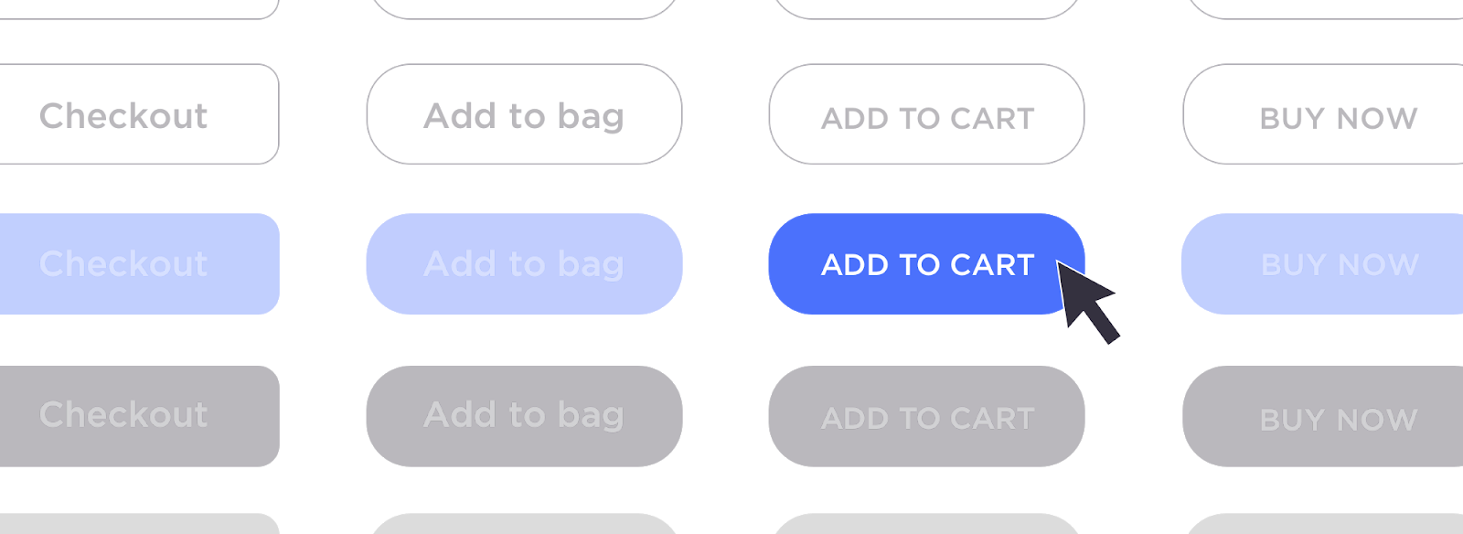
The call to action (CTA) is a fairly good and obvious place that you can start testing because it can lead to very powerful and impactful conversion improvements. There are several choices for testing what works the best for your CTA:
- You can try using a button for your page’s CTA instead of a link, or you can place a phone number on your app or website for customers to either call or text you.
- It’s recommended that you test the button color – no matter where or what the button may be (a download, phone number…etc.) even if it is inside the form.
- Next, you can test the placement of where you are displaying the CTA on your page. As an example, are your phone numbers in the top navigation, in the header image, or at the bottom of the page?
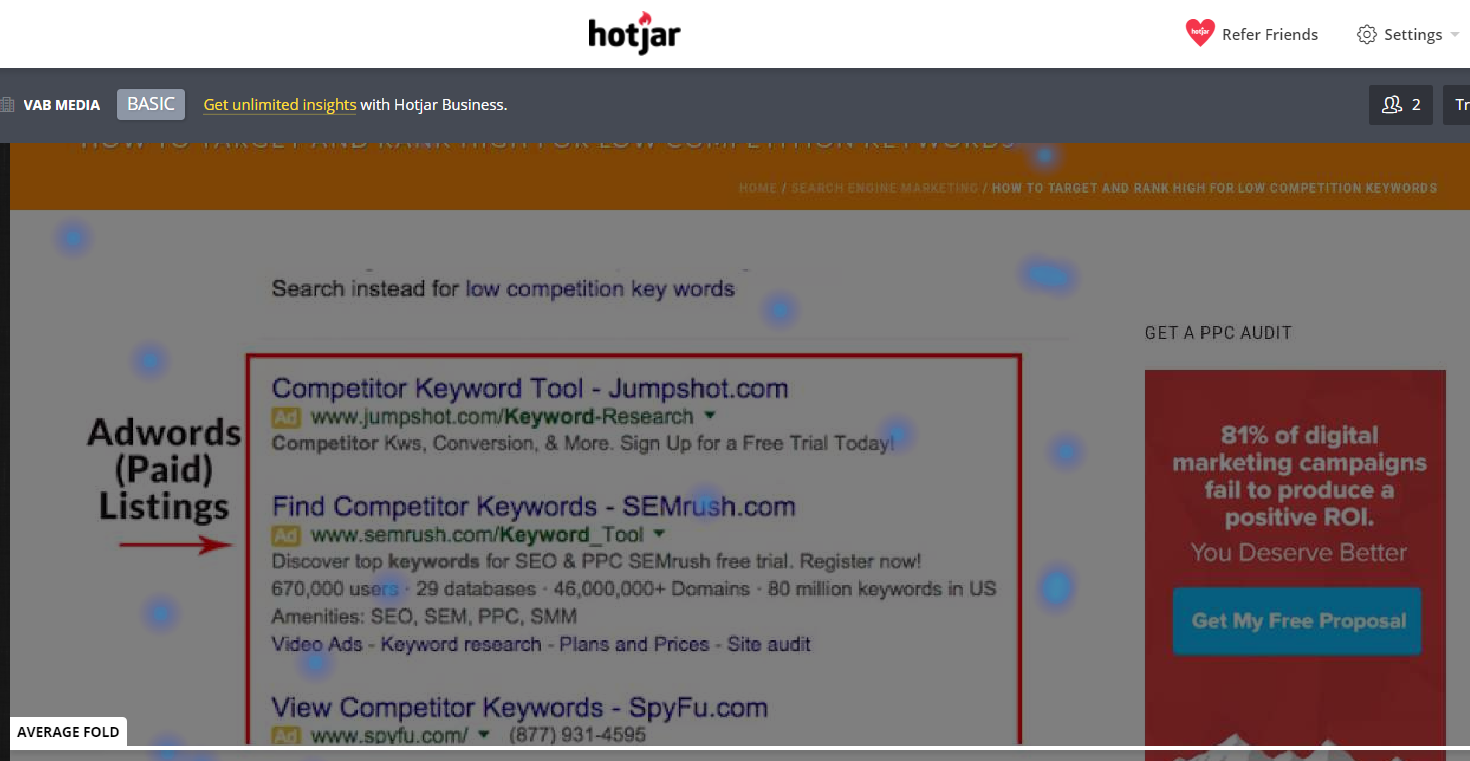
- You may also try testing multiple CTAs, even if they are a “repeats.” I sometimes see a CTA at the top of the page but nothing at the bottom, which is making the assumption that your target user is going to perform your desired action before scrolling down or reading remaining content. You may install and use Heatmap software like Crazyegg or Hotjar to test how far website visitors scroll. If users have read the content or offer, then that is a great time to invite them learn more. You can run a test using the same CTA at the top and bottom for ease of use.
- Finally, you can test the actual ad copy and call to action. There are almost unlimited methods of persuasion copy ideas to try. I am sure there are entire posts on this type of landing page A/B testing. A lot may depend on what you are trying to sell, your lead generation desire, eCommerce, event registration and whether or not you operate a B2C or a B2B product or service. Here are a few ways you can do this: “call now”, “request a quote”, “see it in action”, “get your copy now”, “register now”, “get a free quote”, “learn more”, “add to cart”, “start my _____ now”, “sign up for a free account”, “request demo”, “try it free”…the list can go on and on.
Test the Lead Capture
Forms, which are one of the most popular and important components of a landing page, are critical. There are a ton of different options for testing forms, and even slight changes can cause a significant lift in conversion. Here are some creative things you can try:
6.You can test the placement on the page: is it centered, on the left side or right side? Is it below the fold or above it?
7. Test the color of the form to see if it stands out more.  
- You can also test a form’s layout: horizontal vs. vertical, drop-down fields vs. radio buttons …there are even more options than these two alternatives.
- Another important form test, especially if the user is viewing it on phone, is testing requiring fewer form fields. It’s great to know as much information as possible about a prospective lead: name, phone number, a credit card for the free trial, annual revenue, dental records, (just kidding), and so on. But could your business live without some of this information initially if it meant higher conversions? Some form fields may be causing bottlenecks where users drop off and never complete it.
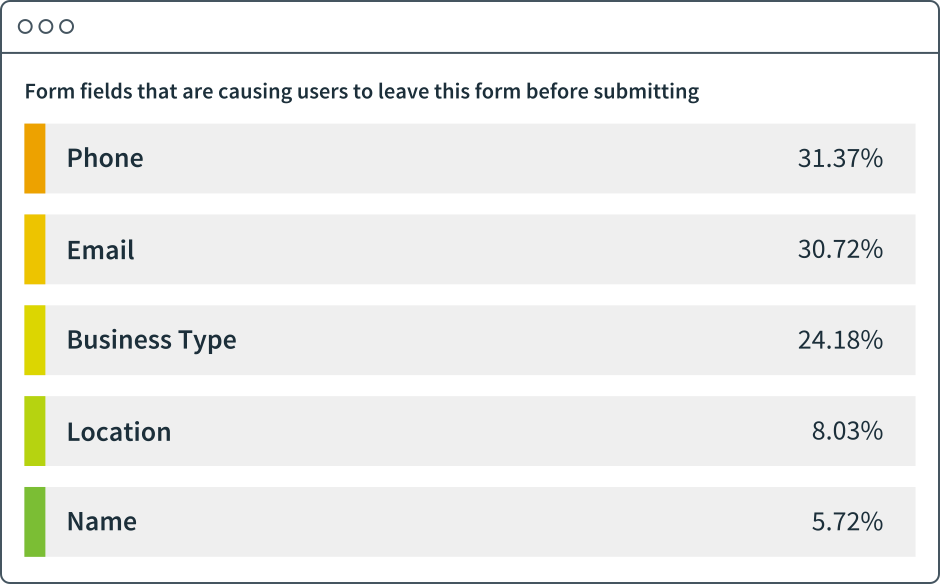
(image credit: Formstack)
- Try testing discreet pop-ups while the user is navigating if you are able to launch them without disrupting the user experience of the page. As an example, the customer acquisition software company Hubspot has lead flows that can be triggered based upon specific or certain parameters. These can be executed without interrupting the user’s ability to navigate the website. (One caveat, if you are driving or running a PPC ads as the traffic source to the page, depending on the network that you are using, make sure pop-ups are not a violation of their policies.)

(image credit: WSJ)
- Test a pop-up overlay when the user leaves the site. However, make it valuable to the user and definitely not annoying! And again, as we mentioned before if you’re running ads to drive users to this page, just ensure pop-ups are not a violation of the ad network’s policies. As the example above using Optinmonster software demonstrates.
Test Different Images
So as cliche as the saying goes, “a picture is worth a worth a thousand words.” High-quality images can provide context and direction that visitors notice very quickly to understand if the landing page is relevant to what they were researching. 3M corporation ran a study which stipulates that our brains process visual information “60,000 times faster than text”. This means that the first thing people see on any landing page, banner, pricing page or email marketing campaigns are your images (and the colors). Let’s also not forget the aesthetic background appeal of images that are used to supplement the text on a page.

(image credit: Getliftup)
However, I have seen some images used that do not add value, and even worse, some that can even drive people away by misleading the visitor as to what the page’s content, purpose or intended audience is. Tip- the image should highlight your value proposition and show customers within seconds “what’s in it for them.” To make sure you use and select image that help to improve a page’s conversion, try running some of these tests:
- You can try testing images with people vs. images without people in them. Often times photos with people (especially stock) may look staged and unnatural, but on the flip side to that, images with people can help visitors build or feel a connection to the brand.
- Test icons and vectors instead of pictures. There are circumstances where photographs are not able to illustrate key points as well as vectors or other types of images.
- Test the size of any image on the page.
- Test the location of the image being placed, or whether there should be an image on the page at all.
- Consider testing pictures and screenshots in pictures with more abstract meanings. (This can be especially true for software as a service companies like SAAS). Of course, product pictures would be used for things like retail, e-Commerce and restaurants.

(image credit: Getliftup)
- Test a new header or hero image.
- You can test a banner with text, on top of it or in lieu of a header image.
Change Up and Rework the Layout
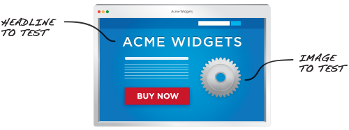
Sometimes your landing pages could use a structural layout overhaul. It can be difficult to get there with A/B tests, but it can be done. And, as a general best practice, test one page element or component at a time–there is value in running multivariate tests.
(image credit: Optimizely)
- Studies have shown that many people scan and read content in an “F” pattern. Try testing and placing your most important elements so that they fall within this line of sight.
- Test the landing page with a header image or hero banner vs. a page without it.
- Try testing and including the CTA as part of the header image vs. entirely separate.
Test and Put your Copy to Work
The copy you use on your landing page should tell and convey a story. We all have heard the phrase too much that “content is king”, but it is still often found on landing pages that are created on the fly. It can be beneficial to revisit the value proposition of your copy and to test a few different tactics in order to make the copy more impactful. Here are some suggestions:
- A/B test a new copy to try and make your page more convincing and persuasive.
- Look into the traffic metrics and stats for the page you are testing, and then test creating pages for your highest-volume markets and personas so that you can provide an experience that is hyper-relevant to those visitors.
- There will be times (especially with paid ad traffic) when the amount of text on a page can be overwhelming. Most people scan a landing page, as opposed to read the entire page, word-for-word. Run a layout test by breaking up the content into smaller paragraphs, use bullet lists or break it up with images in between sections, so that your post seems more approachable and easier to consume.
- Test emphasizing key points with block quotes, images of quotes or by even incorporating them into the sub headers.
- You can test and try adjusting your landing page copy to be written in an active voice vs. a passive voice.
- Test creating copy and imagery that is solution-oriented instead of feature-centric.
- Test how much content is visible above the fold vs. below it. Pro-tip: even consider testing exactly what text falls right above the fold.
- Test using interactive content such as video, quizzes or pages that users can interact with.
- Test personalizing the content on the landing pagen. There are a number of tools that can help with you achieve this, including some marketing automation tools.
- Test whether including testimonials causes a lift in the conversion rate.
- You also should try updating and A/B testing your meta-title and meta-description to see if that boosts traffic and the click-thru-rate to your page through organic results or other channels like social, which show the meta description of the page. This can also be very beneficial for landing pages that were missing meta-descriptions to begin with because weren’t meant to rank (used for email or PPC campaign).
Test the visibility of elements distracting from goal completions
The way your visitors navigate pages (or don’t) is a critical component of the way your story is being told, so it’s important to be mindful of the way you want your visitors to interact with your page. A landing page is usually a standalone page, with no navigation links or other distractions that would keep visitors from converting — making the user experience more focused when compared to a full website.
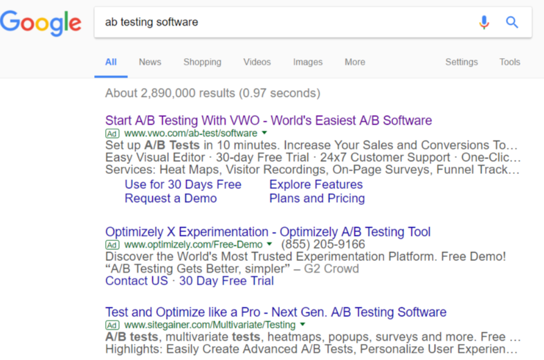
If you are running a retargeting or PPC advertising campaign, rarely do you see a landing page perform the best that had full navigation, but under some circumstances a page with limited navigation performed better than a page with no navigation, (especially with a b2b software product) because it allowed the visitor to explore more information about the product before committing to a demo. If I do a search for “ab testing software” you get a few choices, as shown and the 2nd choice is from optimizely.
Optimizing a landing page’s headline using message matching strategies, includes easy-to-read copy, a choice to use a limited top navigation, only one CTA, bullet points, short form and social proof of all famous brands that use their platform.
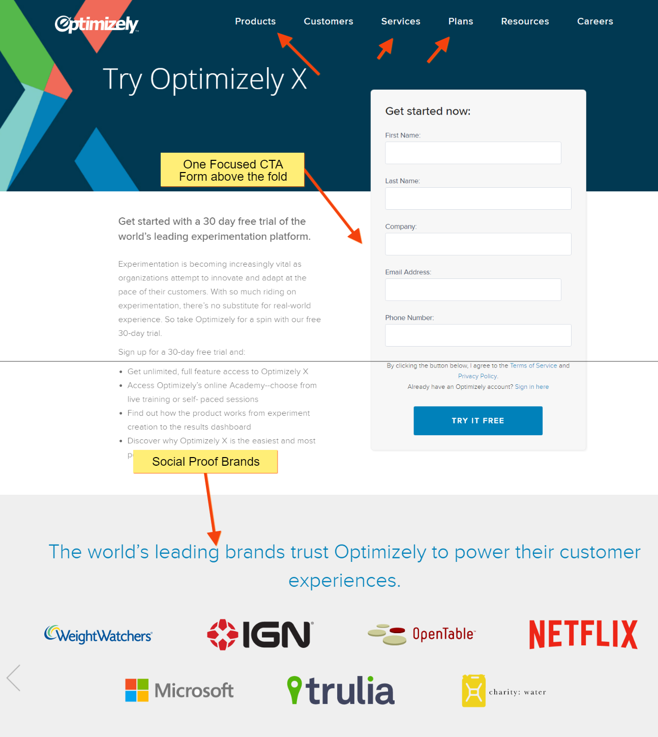
(Image credit: Optimizely)
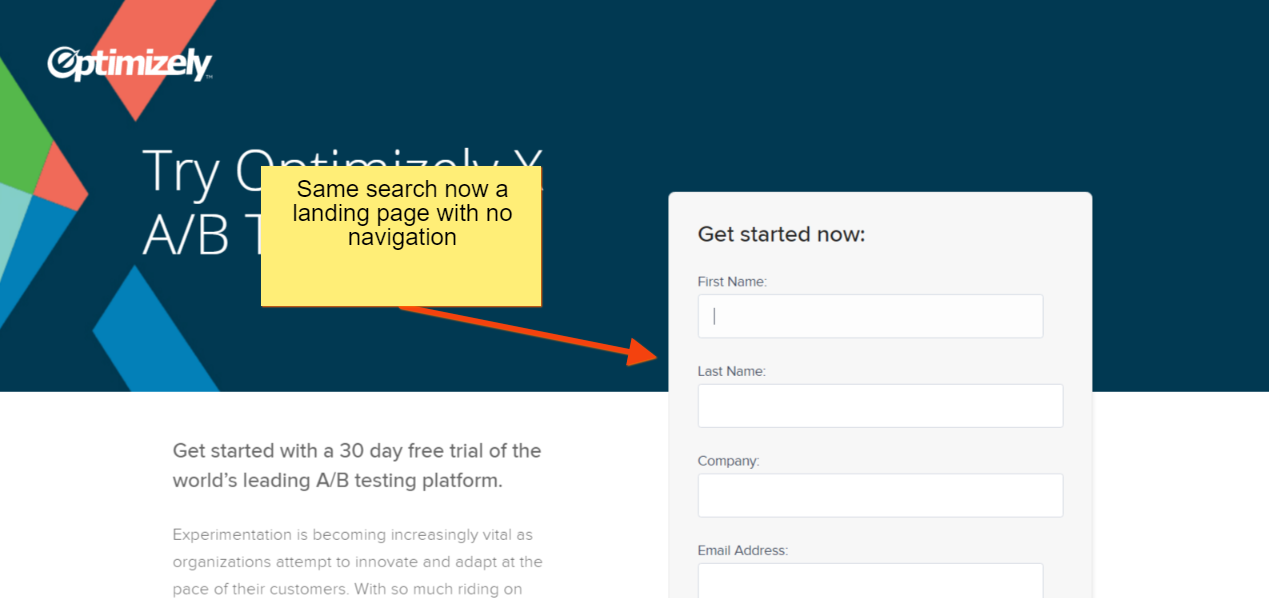
When I click back to same search for “ab testing software”, optimizing is showing me another landing page with no navigation on it. They are testing which landing page leads to more trial signups.
(Image credit: Optimizely)
- Test landing pages with no navigation versus full navigation.
- If it turns out that you find that using full navigation converts best, you can also try testing a secondary navigation option to help them find more information about your product or service that they have shown some interest in, so they quickly find out more to help them make a decision.
- You also can try testing the winner of the above test benchmarked against a few different limited navigational options.
Provide Collateral & Content
I am big fan of micro-conversions, in the right circumstance. So you can provide useful content to users or potential customers to help them continue along their fragmented path to purchase, while obtaining more info about them and where they are in your sales funnel. With this will come several testing opportunities:
- In spite of the fact that the call, demo or purchase request may be your company’s main CTA, you may want to test a secondary CTA (like a signup email newsletter or downloadable whitepaper). Then, your business development team can follow through to see if the addition of those micro conversions is leading to more sales long term.
- Test whether gating or not gating generates more qualified lead prospects. For paid search campaigns, you can do this by building audiences off of a piece of content and then tracking what happens to those audiences. Or, you can use Kissmetrics or Google Analytics to analyze flow reports, but just keep in mind there are some limitations given these are based upon sessions, not users.
- Test different content offerings, to see which performs better. As an example, if you are creating an e-book, you could try recording yourself reading the e-book and create an audiobook or podcast. Then you could test which of those brings in more conversions.
Experiment with Cross-selling or Upselling
Most conversion rate optimization strategies focus on the main selling goal, but there are other opportunities for product or service upsell and cross-sell conversion rate testing as well. Here a couple of opportunities:
- Before the lead submission or purchase is completed, suggest other items the customer may like or find value in.
- You can suggest additional features and add-ons the customer might like access to before the purchase is completed.
- Before the purchase or lead submission is completed, suggest other products that compliment the customer’s needs.
- After the purchase, provide content and information about additional relevant products and services.
It’s Important to Focus on Continuing Engagement 
(Image credit: Looker)
If you are an e-Commerce company, take it a step further. Once you get a user or customer, attribute where you got them from, how much you paid for them and the time it takes to recover from that acquisition cost. Don’t stay on the surface. You paid for those clicks. You need to know. And that’s the only way you’ll truly understand your customer’s lifetime value. You will want to find ways to maximize the customer’s lifetime value to your company by keeping engagement going.
- After the initial purchase, test providing additional content to ensure customers get the most out of their purchase, this especially important with B2B SAAS products.
- After the purchase, create opportunities for customers to share their purchase or experiences with your product.
- After the purchase, try inviting those new customers to follow your social networks and provide product or service feedback.
Evaluate the Quality of Traffic
If you have tested and tested your landing pages, and you still find that your conversion rates are fairly low (under 3 percent), it might be that the traffic isn’t as relevant or targeted as it could be. Take a look in your analytics platform to determine if there are traffic sources or keywords that aren’t performing as well as others. Then dig in further from there.
Conclusion
I know that without a proper conversion optimization strategy no matter how good an idea is for another business, it might never work for yours. But I also know that sometimes all you need is a glimpse of inspiration from someone else to help you come up with your new winning idea.
Have I missed anything, do you have any other landing page experiments to add? I want to know. Leave a comment below.

